Why Coca-Cola's Website Works Better Than Yours
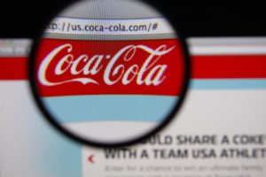
 If you haven’t visited the Coca-Cola website, take a quick look sometime. Your hospital or medical practice does not have to be a global business icon for you to recognize why Coke’s website produces measurable results…and your website does not.
Stick with me on this. There’s an insightful backstory to the comparison challenge, so I’ll share that tale first.
Recently, we were talking with the principal of a medical practice that was in desperate need of a new website. In their digital strategy, Pay-per-Click traffic was connecting with the website, but prospects were not converting to serious leads—instead, most traffic was simply disappearing.
The business needed a new website, but—not surprisingly—budget was a longstanding concern. The reasons were apparent. At best, their current online presence scored as “outright awful.” It was out of date, lacking fundamental elements of design, absent differentiation, had broken functionality, and was lacking call-to-action directives. Many of the web form pages simply did not work, there was a population of dead links, and overall, it had no compelling sizzle.
However, the site had plenty of pages—nearly 100—about half of which contained duplicate copy of dozens of other websites. (Duplicate copy is a big no-no in the Google playbook.) Much of the text was lifted straight from a 1989 medical journal. Maybe site visitors were “self-diagnosing,” or writing a term paper—but they were not requesting a doctor’s appointment.
Recommendation: A real website and a new beginning...
To effectively market their four main service lines, we recommended a complete redesign with built-in landing pages for the four main services lines. This includes unique copy and SEO writing, eliminating duplicate content, strong functionality, and preparing 50 new, original pages. The proposed cost was serious. Although a relatively modest total and strong value for the scope of work, it was a budget-shocker.
The individual ventured that “maybe they don’t need 50 pages.” We advised him that the cost was the same regardless of the number of pages. The important message was that they had an ineffective and bland informational website — a relatively poor one at that. What they needed was a marketing-driven website that produces measurable results. The purpose of the site was not to discuss symptoms, but to present a permanent solution — and why they need a doctor. “This is your opportunity to tell the audience why they need you.”
The Coca-Cola website comparison challenge…
To illustrate this distinction, I asked: “Have you ever visited the Coca-Cola website? Does their site post their product formulas? Do they have biographies of each of the company’s 'flavor scientists?' Do they include photos of the bottling machines? Do they point to hundreds of white papers about carbonated beverages?"
The answer is NO, of course not. What they have is a user-focused marketing site. They have big bold photos depicting 'Coke Life’, telling you where to buy Coke, how to enjoy Coke, how to win Coke, how to share Coke. They even market a Coke with YOUR name on it.
Their website, and all their other marketing material, is on-brand and always selling a product.
Is your healthcare website on-brand? Is it selling you and patient benefits?
The principal got the message loud and clear. To turn web visits into phone calls, the business needed a marketing-driven website, not an informational site. This isn't "brochure-ware." It's about creating new business. With that in mind, the budget didn’t look so big. The website re-do was about the Return-on-Investment, a serious opportunity to differentiate from the competition, strengthen individual and collective reputation, and actively generate new business.
He put on his sales hat and walked into his partners meeting with sensible, new ammunition. Marketing was an investment, not an expense.
Two hours later, we received an email with two thumbs up.


